data analysis and with Car Evaluation Database
The data is available here
The source code is available here
Basic Infomation according to the offical infomation
Instruction
- The dataset is mainly a classification problem to predit
- There is 1728 samples
- Class distribution shows the most of the samples are not acc(uracy?)
 class      N          N[%]
 -----------------------------
 unacc     1210     (70.023 %)
 acc        384     (22.222 %)
 good        69     ( 3.993 %)
 v-good      65     ( 3.762 %)
Attribute
   CAR                      car acceptability
   . PRICE                  overall price
   . . buying               buying price
   . . maint                price of the maintenance
   . TECH                   technical characteristics
   . . COMFORT              comfort
   . . . doors              number of doors
   . . . persons            capacity in terms of persons to carry
   . . . lug_boot           the size of luggage boot
   . . safety               estimated safety of the car

   buying:   vhigh, high, med, low.
   maint:    vhigh, high, med, low.
   doors:    2, 3, 4, 5more.
   persons:  2, 4, more.
   lug_boot: small, med, big.
   safety:   low, med, high.
The first thing i did is to visulize the data.
And before that, i have a look at the correlation of the data, which has confused me since then.
Wired part during feature engineering and preprocessing
%matplotlib inline

import numpy as np
import pandas as pd
import matplotlib.pyplot as plt
import os

data = pd.read_csv("~/Code/typedCode/python/ML/CarEvaluation/data.txt")


# feature engineering and preprocessing
data.buying.replace(to_replace={"vhigh": 4, "high": 3, "med": 2, "low": 1}, inplace=True)
data.maint.replace(to_replace={"vhigh": 4, "high": 3, "med": 2, "low": 1}, inplace=True)
data.doors.replace(to_replace={"5more": 5}, inplace=True)
data.persons.replace(to_replace={"more": 6}, inplace=True)
data.lug_boot.replace(to_replace={"small": 1, "med": 2, "big": 3}, inplace=True)
data.safety.replace(to_replace={"low": 1, "med": 2, "high": 3}, inplace=True)
data.evaluation.replace(to_replace={"unacc": 1, "acc": 2, "good": 3, "vgood": 4}, inplace=True)

print("data shape : ", data.shape)

print(data.columns)
(1728, 7)
Index(['buying', 'maint', 'doors', 'persons', 'lug_boot', 'safety',
'evaluation'],
dtype='object')
print(data.describe()) buying maint lug_boot safety evaluation
count 1728.000000 1728.000000 1728.000000 1728.000000 1728.000000
mean 2.500000 2.500000 2.000000 2.000000 1.414931
std 1.118358 1.118358 0.816733 0.816733 0.740700
min 1.000000 1.000000 1.000000 1.000000 1.000000
25% 1.750000 1.750000 1.000000 1.000000 1.000000
50% 2.500000 2.500000 2.000000 2.000000 1.000000
75% 3.250000 3.250000 3.000000 3.000000 2.000000
max 4.000000 4.000000 3.000000 3.000000 4.000000
print(data.corr()) buying maint lug_boot safety evaluation
buying 1.00000 0.000000 0.000000 0.000000 -0.282750
maint 0.00000 1.000000 0.000000 0.000000 -0.232422
lug_boot 0.00000 0.000000 1.000000 0.000000 0.157932
safety 0.00000 0.000000 0.000000 1.000000 0.439337
evaluation -0.28275 -0.232422 0.157932 0.439337 1.000000
So, there is the wired part:
The persons and doors columns doesn’t show in the corr() result and even the describe().
So, i tried the fllowing operations, and the result really amazed me to some extent:)
persons = data.persons
doors = data.doors
evaluation = data.evaluation
wiredData = pd.concat([persons, doors, evaluation], axis=1)

print(wiredData.iloc[:10, :])

print(wiredData.describe())

print(wiredData.corr())
persons doors evaluation
0 2 2 1
1 2 2 1
2 2 2 1
3 2 2 1
4 2 2 1
5 2 2 1
6 2 2 1
7 2 2 1
8 2 2 1
9 4 2 1
evaluation
count 1728.000000
mean 1.414931
std 0.740700
min 1.000000
25% 1.000000
50% 1.000000
75% 2.000000
max 4.000000
evaluation
evaluation 1.0
To me, the above output shows that the wired columns do not contribute to the prediction.
Visualization
buying = data.iloc[:, 0]
maint = data.iloc[:, 1]
lug_boot = data.iloc[:, 4]
safety = data.iloc[:, -2]
evaluation = data.iloc[:, -1]


# buying : evaluation
ax = plt.subplot("221")
evaluationMeans = [data.loc[lambda df: df.buying == int("%d" % i),
                            lambda df: df.columns[-1]].mean() for i in range(1, 5)]

plt.bar(range(1, 5), evaluationMeans, 0.35)
plt.xticks(range(1, 5), ["vhigh", "high", "med", "low"][::-1])
plt.yticks(np.arange(1, 3, 1), ["unacc", "acc", "good"])
plt.xlabel("buying")
plt.ylabel("Means of evaluation")
ax.spines['top'].set_visible(False)
ax.spines['right'].set_visible(False)
for x, y in zip(range(1, 5), evaluationMeans):
    plt.text(x - 0.25, y + 0.05, "%.2f" % y)

# maint : evaluation
ax = plt.subplot("222")
evaluationMeans = [data.loc[lambda df: df.maint == int("%d" % i),
                            lambda df: df.columns[-1]].mean() for i in range(1, 5)]

plt.bar(range(1, 5), evaluationMeans, 0.35)
plt.xticks(range(1, 5), ["vhigh", "high", "med", "low"][::-1])
plt.yticks(np.arange(1, 3, 1), ["unacc", "acc", "good"])
plt.xlabel("maint")
plt.ylabel("Means of evaluation")
ax.spines['top'].set_visible(False)
ax.spines['right'].set_visible(False)
for x, y in zip(range(1, 5), evaluationMeans):
    plt.text(x - 0.25, y + 0.05, "%.2f" % y)


# lug_boot : evaluation

ax = plt.subplot("223")
evaluationMeans = [data.loc[lambda df: df.lug_boot == int("%d" % i),
                            lambda df: df.columns[-1]].mean() for i in range(1, 4)]

plt.bar(range(1, 4), evaluationMeans, 0.35)
plt.xticks(range(1, 5), ["high", "med", "low"][::-1])
plt.yticks(np.arange(1, 3, 1), ["unacc", "acc", "good"])
plt.xlabel("lug_boot")
plt.ylabel("Means of evaluation")
ax.spines['top'].set_visible(False)
ax.spines['right'].set_visible(False)
for x, y in zip(range(1, 5), evaluationMeans):
    plt.text(x - 0.25, y + 0.05, "%.2f" % y)


# safety : evaluation

ax = plt.subplot("224")
evaluationMeans = [data.loc[lambda df: df.safety == int("%d" % i),
                            lambda df: df.columns[-1]].mean() for i in range(1, 4)]


plt.bar(range(1, 4), evaluationMeans, 0.35)
plt.xticks(range(1, 5), ["high", "med", "low"][::-1])
plt.yticks(np.arange(1, 3, 1), ["unacc", "acc", "good"])
plt.xlabel("safety")
plt.ylabel("Means of evaluation")
ax.spines['top'].set_visible(False)
ax.spines['right'].set_visible(False)
for x, y in zip(range(1, 5), evaluationMeans):
    plt.text(x - 0.25, y + 0.05, "%.2f" % y)

plt.tight_layout()
plt.show()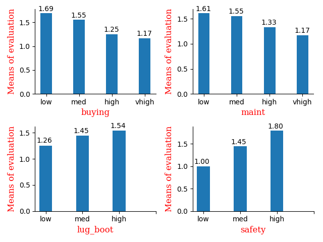
I chose bar to show the relation between attributes and the means of the evaluation
Actually the corr() gives me enough info to train the model
Model builting
from sklearn.preprocessing import MinMaxScaler
from sklearn.svm import SVC
from sklearn.model_selection import train_test_split


#data = data.values.astype(np.float)

mms = MinMaxScaler()
X = mms.fit_transform(data[:, :-1])
y = data[:, -1].ravel()

X_train, X_test, y_train, y_test = train_test_split(X, y, test_size=0.3)

score = []
parms = np.arange(1, 10, 1)
for i in parms:
    clf = SVC(C=i, gamma=4) # C = 4 gamma=4
    # clf = GradientBoostingClassifier(n_estimators=i) # n_estimators = 140
    clf.fit(X_train, y_train)
    score.append((clf.score(X_train, y_train), clf.score(X_test, y_test)))

plt.plot(parms, [i for i, j in score], "ro-", label="train")
plt.plot(parms, [j for i, j in score], "go-", label="test")
for i, s in zip(parms, score):
    plt.text(i, s[0] + 0.0001, "%.4f" % s[0])
    plt.text(i, s[1] + 0.0001, "%.4f" % s[1])


plt.xlabel("C")
plt.ylabel("Error")
plt.legend()
plt.tight_layout()
plt.show()
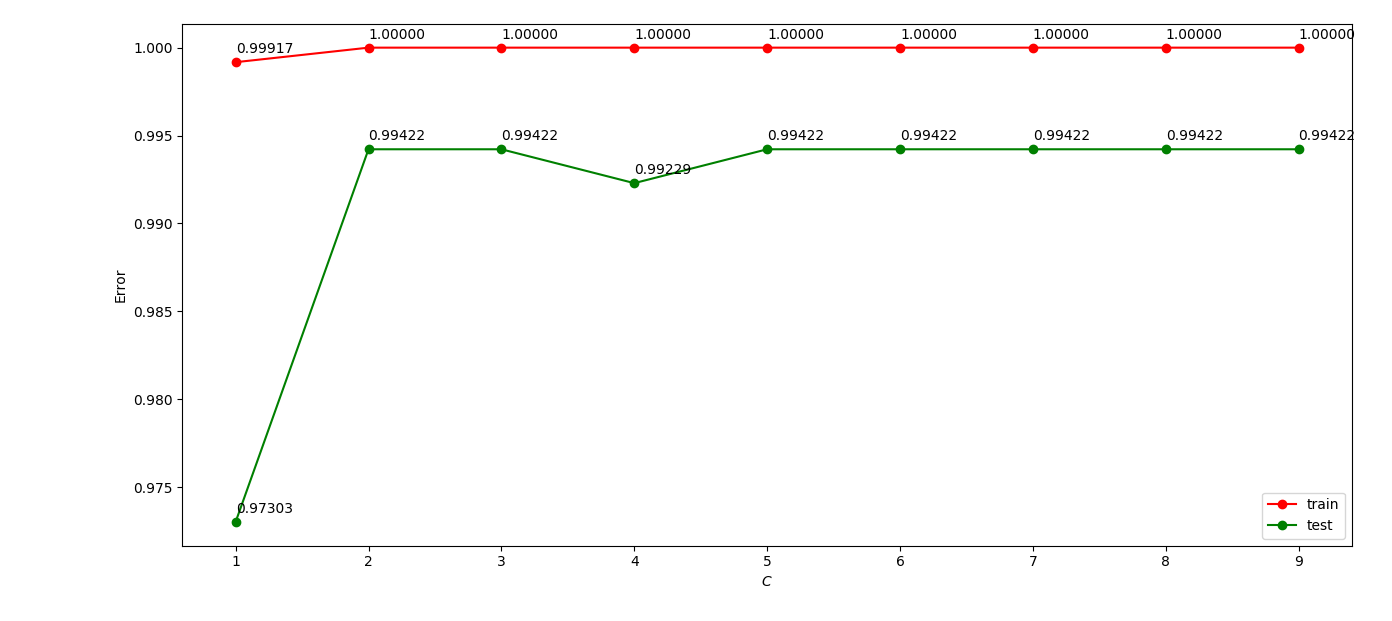
I normalized the data then feed them to the SVC model, and adjust the parms C and $\gamma$.
The GBDT model was also used and i adjusted the parm n_estimators only.
Summary
- The samples of the data is really small, so it doesn’t take me so much time to run the model.
- As there are a little attributes so that they do not need decomposition, l still think the ‘irrelevant’ columns can be decomposed by PCA or something else.
- Still need to work on data visualization to achieve more infomation from the data.